A lovely pun, a great statue, commissioned in 1967, for, of course, a hot dog and beer restaurant.
Intended to become the start of a franchise, the restaurant sat near the intersection of two highways in Lake county, Indiana.
Not long after the 20 foot tall fiberglass statue was installed, the young owners received a cease-and-desist order from Universal pictures, claiming copyright infringement, and demanding licensing fees, which they couldn’t afford.
According to Wikipedia:
“An agreement was reached with Universal Pictures that they needed to remove the neck bolts, forehead scar, green face and hands plus change the black jacket and pants to red and gray, respectively.”
There were also other complaints that it was an eyesore, a driving distraction, and violated new laws about highway beautification.
Sigh…..
I mean… if that’s not highway beautification, what is?
I saw it credited to Dutch artist Michiel Shrijver, but when I looked him up, I never found this painting… And most of the info and sites were in Dutch
That’s so cool. Every angle is so different. We spent a good half hour just walking around it looking at the different reflections.
I guess you could say I’ve bean here.
I just read that the artist, Anish Kapoor, originally hated that people called it The Bean…. he said it was stupid.
He calls it Cloud Gate. Its shape is based on the way a ball of liquid mercury rolls and transforms.
But because people loved the work, he came to realize that the nickname is affectionate, so, while its title is still Cloud Gate, he’s happy now that people call it The Bean.
This photo doesn’t really show how huge it is… the arch underneath is about 12 feet high, and it weighs 110 tons.
Railway nerd here: I’m thinking that this is at a Terminus on either the LMS (London Midland and Scottish Railway), or the GWR (Great Western Railway). I’m going by the two tone colours on the coach, but would really need to see the bogies (Trucks), or a colour picture to be certain. The LMS coaches would have been Carmine and Cream, and the GWR coaches would have been Chocolate and Cream.
If it is the LMS, and London, then the logical location would be St Pancreas, and for the GWR, Paddington. To try and confirm a location, I did a bit of a search looking at the internal contemporary photos of the two London stations, and have concluded, if it is the London station, then it is Paddington. The columns and the horizontal roof ties look correct for the side platforms at Paddington.
Nice work but it doesn’t look like it was actually done in the 1920s…
Nor does it resemble Weimar art. The face and helmet are entirely too modern.
I searched high and low, and found lots of places selling copies, but if they had any description at all, it said something like “beautiful vintage poster.”
No artist’s name, no actual date. And people throw around the word “vintage” these days, using it to describe anything from actual antiques, to 2017 movie “collectibles”, to modern jewelry designed to look retro.
Finally I realized it was right there in front of me…. Teeny tiny print in the lower right margin: Mitch Angelo 2023.
“Metropolis” is from 1927. #maria
Bauhaus is timeless. Its emblem since 1920:
Oh – and here’s the actual poster for the exhibition in the city of Weimar (1923) above:
Yes, thanks… and you can see that the realistic face above would not fit in with these two Bauhaus pieces.
Several movements were going on at the same time, overlapping and not. I’ve studied them a little, but I’m not going to pretend to be an expert on them… There’s more that I don’t know than that I do.
Bauhaus was the most … I’m going to say strict and mechanical, though those might not be the right words. It followed the earlier principle that form should follow function.
It has some things in common with Art deco, celebrating industrialism, but minus the luxury, the sinuous curves, and ornamentation.
German expressionism, OTOH, includes emotional content, a wider color palette, and distorted figures
“Metropolis” is considered an expressionist film, though it looks so mechanical. “The Cabinet of Dr. Caligari” is frequently given as the quintessential example.
Weimar art absorbed parts of all of these and more…. but not Mich Angelo’s 21st century realism.
I see what you mean… But I think it’s just that he’s craning his neck, with his chin forward, which foreshortens his neck, and lowers his face, coupled with the harsh shadows of the camera flash.
They’re evidently gathered here for The Prudential Family of Stars Radio Hour.
The caption didn’t say whether they were all on the program that day, or just doing publicity for the program in general.
….
BTW this what I was talking about the other day, when I said those cute clothes on the street in Times Square showed the last of the early 40s influence on style.
Same year, here, IIRC… 1948… But movie stars are richer and more quickly fashionable.
This was the New Look, started by Christian Dior “the war is over, no more shortages, let’s cram an extra 2 yards of fabric into every dress”.
Women’s clothes kept getting longer, softer, boxier, on into the fifties.
Yes. A friend of mine has had a few issues with melanomas on his head, and he was mentioning that it was only on the right side. I pointed out that it was probably due to driving as I remembered this picture from some time back. Turns out that my friend had driven a delivery van for several years, so that’s why the issues he was having were only on his right side of his head.
In the UK, houses will generally be numbered with odd numbers on the LH side of the road, and even numbers on the RH side of the road, rising sequentially.
So, to me,
Alice is on the left of the picture carrying the sword, and Jane is the one on the right carrying the book.
The second question is answered by the first answer.
.
Just to throw a spanner in the works….
My road just has to be different! The houses in my road, which is a Cul-de-Sac, were originally numbered sequentially from the first house on the left (Number 1), all the way down the left side of the road, round the end of the road, and continuing back along the RH side of the road (On which the houses are all facing away from the road…) and finishing at number 20, which is opposite number 1. Just to throw another spanner in the works, a spare plot, opposite number 20, that used to be a pumping station, was built upon, and because it was divided into two plots, and only the rear plot was built upon, the first house on the left as you enter the road is number 22, the next house along is the side of number 33 of a different road, and then you get to number 1, which being semi-detached (A Duplex?), adjoins number 31 of that other road….
In the US, towns & cities often have a “Main Street” with house numbers increasing in both directions as you cross Main. That is, the cross streets each go from N Whatever St. to S Whatever St. (or from “East” to “West” if Main runs N-S). The low numbers indicate that they are close to Main.
Leo Carrillo (Pancho) was part of one of the oldest, most influential families in California, starting with Spanish land grants, long before statehood.
He was educated, and well spoken, in English and Spanish, with no trace of either accent in the other
He wrote and did political cartoons for newspapers, was an early environmentalist, and for years sat on the California Coastal Commission. He even has a state beach named after him.
He loved acting, and faked the over the top “Mexican” accents he used as Pancho, and in many movies.
Even aside from the fake accents, which weren’t as “politically incorrect” back then…. it’s hard for me to totally admire him, because he advocated for, and was an influence behind, the internment of innocent Japanese Americans in WWII.

.
“I found an empty parking spot.
I parked.
Any more stupid questions?”
That should be ‘Empty barking spot’…. 😉
Yeah … I like that, of course… but this dog can’t be bothered to bark…. and I remembered Cleo already did a parking/barking pun.
Speed bump.
Flat basset. This walk is over. (I’ve had to carry mine home…)
..
My definition of heaven. I’d name the one on the right Fjord.
The left one looks like a Bonny to me. And the middle one stretchy bunny.
…bunny?…
…
A lovely pun, a great statue, commissioned in 1967, for, of course, a hot dog and beer restaurant.
Intended to become the start of a franchise, the restaurant sat near the intersection of two highways in Lake county, Indiana.
Not long after the 20 foot tall fiberglass statue was installed, the young owners received a cease-and-desist order from Universal pictures, claiming copyright infringement, and demanding licensing fees, which they couldn’t afford.
According to Wikipedia:
“An agreement was reached with Universal Pictures that they needed to remove the neck bolts, forehead scar, green face and hands plus change the black jacket and pants to red and gray, respectively.”
There were also other complaints that it was an eyesore, a driving distraction, and violated new laws about highway beautification.
Sigh…..
I mean… if that’s not highway beautification, what is?
I suppose some considered it a monstrosity.
I see what you did there 😉
Frankly, you’re right!
You couldn’t resist taking it one step furter.
,
There must be a story with this
I tried looking it up, but got nowhere.
I saw it credited to Dutch artist Michiel Shrijver, but when I looked him up, I never found this painting… And most of the info and sites were in Dutch
,,
That’s so cool. Every angle is so different. We spent a good half hour just walking around it looking at the different reflections.
I guess you could say I’ve bean here.
I just read that the artist, Anish Kapoor, originally hated that people called it The Bean…. he said it was stupid.
He calls it Cloud Gate. Its shape is based on the way a ball of liquid mercury rolls and transforms.
But because people loved the work, he came to realize that the nickname is affectionate, so, while its title is still Cloud Gate, he’s happy now that people call it The Bean.
This photo doesn’t really show how huge it is… the arch underneath is about 12 feet high, and it weighs 110 tons.
“Klaatu barada nikto”
Chicago!
,.
Brother Bertie went away
To do his bit the other day
With a smile on his lips
And his Lieutenant’s pips
Upon his shoulder, bright and gay
Good-bye-ee British WW1 Song…
.
Railway nerd here: I’m thinking that this is at a Terminus on either the LMS (London Midland and Scottish Railway), or the GWR (Great Western Railway). I’m going by the two tone colours on the coach, but would really need to see the bogies (Trucks), or a colour picture to be certain. The LMS coaches would have been Carmine and Cream, and the GWR coaches would have been Chocolate and Cream.
If it is the LMS, and London, then the logical location would be St Pancreas, and for the GWR, Paddington. To try and confirm a location, I did a bit of a search looking at the internal contemporary photos of the two London stations, and have concluded, if it is the London station, then it is Paddington. The columns and the horizontal roof ties look correct for the side platforms at Paddington.
,,,
Nice work but it doesn’t look like it was actually done in the 1920s…
Nor does it resemble Weimar art. The face and helmet are entirely too modern.
I searched high and low, and found lots of places selling copies, but if they had any description at all, it said something like “beautiful vintage poster.”
No artist’s name, no actual date. And people throw around the word “vintage” these days, using it to describe anything from actual antiques, to 2017 movie “collectibles”, to modern jewelry designed to look retro.
Finally I realized it was right there in front of me…. Teeny tiny print in the lower right margin: Mitch Angelo 2023.
I looked him up… He’s a digital artist.
“Metropolis” is from 1927. #maria
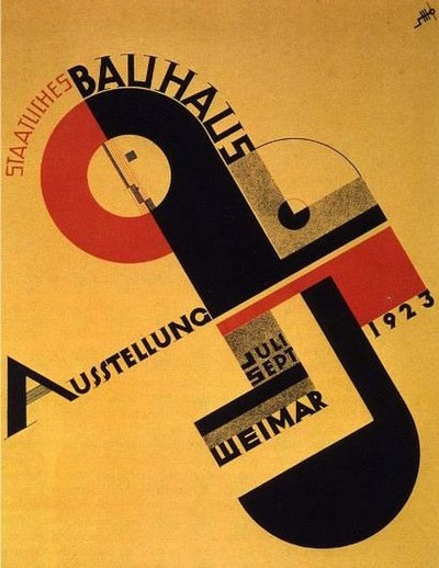
Bauhaus is timeless. Its emblem since 1920:
Oh – and here’s the actual poster for the exhibition in the city of Weimar (1923) above:
Yes, thanks… and you can see that the realistic face above would not fit in with these two Bauhaus pieces.
Several movements were going on at the same time, overlapping and not. I’ve studied them a little, but I’m not going to pretend to be an expert on them… There’s more that I don’t know than that I do.
Bauhaus was the most … I’m going to say strict and mechanical, though those might not be the right words. It followed the earlier principle that form should follow function.
It has some things in common with Art deco, celebrating industrialism, but minus the luxury, the sinuous curves, and ornamentation.
German expressionism, OTOH, includes emotional content, a wider color palette, and distorted figures
“Metropolis” is considered an expressionist film, though it looks so mechanical. “The Cabinet of Dr. Caligari” is frequently given as the quintessential example.
Weimar art absorbed parts of all of these and more…. but not Mich Angelo’s 21st century realism.
Weimar cabaret sign:
It did it to me again. This is a YouTube video by the band Bauhaus.
https://music.youtube.com/watch?v=Yy9h2q_dr9k&si=6iddTcteFBY6ajnn&feature=xapp_share
,,.
I got a couple of them.
Why does it look (To me anyway) that GP’s head (Back left) has been superimposed….
I see what you mean… But I think it’s just that he’s craning his neck, with his chin forward, which foreshortens his neck, and lowers his face, coupled with the harsh shadows of the camera flash.
RM looks almost the same.
I still think that’s a bad photoshop
Too old. Why would somebody bother swapping heads 40 or 50 years later, especially if the cast list is probably available somewhere.
They’re evidently gathered here for The Prudential Family of Stars Radio Hour.
The caption didn’t say whether they were all on the program that day, or just doing publicity for the program in general.
….
BTW this what I was talking about the other day, when I said those cute clothes on the street in Times Square showed the last of the early 40s influence on style.
Same year, here, IIRC… 1948… But movie stars are richer and more quickly fashionable.
This was the New Look, started by Christian Dior “the war is over, no more shortages, let’s cram an extra 2 yards of fabric into every dress”.
Women’s clothes kept getting longer, softer, boxier, on into the fifties.
The two ladies on the right look upholstered.
Even men’s clothes got baggier.
Not my favorite era, cos it flattered few people.
And it was repeated in the 1980s.
,.,.
..,..
And if it’s between whether he’s American or British… obviously he’s American. LOL
Yes. A friend of mine has had a few issues with melanomas on his head, and he was mentioning that it was only on the right side. I pointed out that it was probably due to driving as I remembered this picture from some time back. Turns out that my friend had driven a delivery van for several years, so that’s why the issues he was having were only on his right side of his head.
.
This is the:
Duquesne Incline from Mt. Washington Pittsburgh PA
The photographer is Dave DiCello
Here is its
WEB SITE.
I didn’t know there was a Disnyland in Pittsburgh
Wonderful example of a funicular…. And look! The building caught the moon on its horns!
,
BTDT…
Um… stalker or stalkee?
Both, now that you mention it…
,.
OK, I’ll bite.
In the UK, houses will generally be numbered with odd numbers on the LH side of the road, and even numbers on the RH side of the road, rising sequentially.
The second question is answered by the first answer.
.
Just to throw a spanner in the works….
My road just has to be different! The houses in my road, which is a Cul-de-Sac, were originally numbered sequentially from the first house on the left (Number 1), all the way down the left side of the road, round the end of the road, and continuing back along the RH side of the road (On which the houses are all facing away from the road…) and finishing at number 20, which is opposite number 1. Just to throw another spanner in the works, a spare plot, opposite number 20, that used to be a pumping station, was built upon, and because it was divided into two plots, and only the rear plot was built upon, the first house on the left as you enter the road is number 22, the next house along is the side of number 33 of a different road, and then you get to number 1, which being semi-detached (A Duplex?), adjoins number 31 of that other road….
I’ve got a headache…..
In the US, towns & cities often have a “Main Street” with house numbers increasing in both directions as you cross Main. That is, the cross streets each go from N Whatever St. to S Whatever St. (or from “East” to “West” if Main runs N-S). The low numbers indicate that they are close to Main.
thanks for giving it a stab
(hm…that’s not what Janet Leigh said)
Lol…. I fell asleep trying to decide which ways the numbering could run besides right to left… As MCTS and Strega just explained.
,,.
He was a friend of mine
He drank whisky while we were drinking wine.
Leo Carrillo (Pancho) was part of one of the oldest, most influential families in California, starting with Spanish land grants, long before statehood.
He was educated, and well spoken, in English and Spanish, with no trace of either accent in the other
He wrote and did political cartoons for newspapers, was an early environmentalist, and for years sat on the California Coastal Commission. He even has a state beach named after him.
He loved acting, and faked the over the top “Mexican” accents he used as Pancho, and in many movies.
Even aside from the fake accents, which weren’t as “politically incorrect” back then…. it’s hard for me to totally admire him, because he advocated for, and was an influence behind, the internment of innocent Japanese Americans in WWII.
Carillo was in the Wallace Beery Classic ‘Viva Villa’, where he played a murderous swine.
Not like the likable, jovial Pancho , Cisco’s good. buddy
,.
Dinosaurs are always fun.
Thanks.
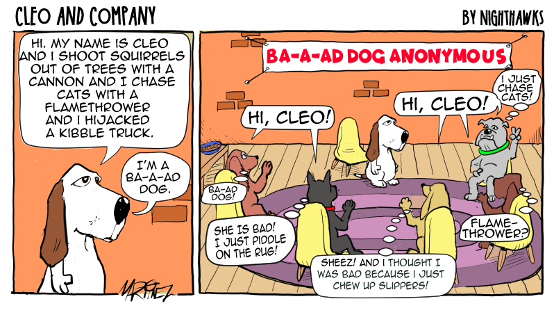
Cleo is demonstrating the art of “humblebragging”…. pretending to feel bad about what she does, but it’s really just to show off.
She lives for those gasps of surprise, the unwilling envy…
and has zero intention of changing her ways.
From today’s London “Daily Mail,:”
I kinda like the pre-disco BeeGees. “Odessa” is one of my favoritest albums, ever.
And she sang, “If you’re crackin up from having lack of shakin up, why don’t pack it up find yourself a crazy kind of love.”
https://imgur.com/QplPBye